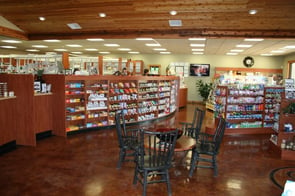
 There are proven formulas to improve the merchandising efforts in your pharmacy’s front end section, or retail area, that include lighting, wall and floor coverings, traffic flow patterns, product placement, and your retail shelving setup. All working together, with every cylinder clicking in unison like a finely tuned machine, the time, effort, and expense of upgrading your store’s merchandising section will be well worth it in the form of happier customers, more repeat customers, and increased sales.
It’s What’s Up Front That Counts
While it’s true that many of your clients come into the store for prescription medications typically prepared in the back end of the pharmacy, folks will still have to mosey through the front end of the store to get to the prescription counter and will often spend time looking around at the various offerings found up front while they're waiting for their medicine.
Updating your look with new modern shelving and display fixtures can have a huge impact on the feel of your pharmacy and can help patrons feel more comfortable and welcomed as well as attractively display the many items you offer that they could just as well buy somewhere else. Many people, however, like the idea of one-stop shopping, and they’ll buy from you if you give them the opportunity and the reason to do so. Here are some great ways to dress up your retail shelving to help that effort along:
- Shelves should always be well stocked. Narrower shelves work best for making the most of your inventory because less merchandise is needed for the shelves to look full. Narrow shelves also require less floor space, giving you more room for additional display options and allowing for easier customer mobility.
- There’s a visual mismatch when new products are put onto old shelving. If you’re living with old shelves, the quickest way to dress them up is to replace them with something new and modern. Space-saving options like slatted wall panels or slatted gondolas are a great space-saving alternative.
- Instead of using two-shelf displays, consider going higher with triple or quadruple shelving. This increases the amount of merchandise you can display without requiring additional floor space.
- You want your front end merchandising space to feature products that will immediately grab the attention of those entering the store. This can usually be accomplished by having the shelves closest to the entry door(s) stocked with seasonal items, holiday merchandise, and frequently purchased items like cold remedies, pain relievers, bandages, et cetera.
- Modern lighting like LEDs can be used to replace old-style fluorescent tube lighting that’s noisy, gives an uncomfortable glare, and can produce uncomfortable feelings and give people headaches. Lighting should be focused so that merchandise can be easily discerned and prices are easy to read.
There are many ways to make your pharmacy more functional while giving customers a more relaxing, enjoyable experience that will make them want to return to your place of business and recommend your store to others. Proper placement of modern, quality shelving can help direct customers along a predetermined footpath designed to bring them through each separate section of the retail merchandise area.
A well-designed checkout area stocked with popular impulse purchase items will also add to your bottom line, especially if it’s located near the back end of the store so that customers are required to walk through the retail area to reach it. Shelving here should be the type to accommodate candy bars, chewing gum, magazines and other daily need items like razors, toothpaste, toothbrushes, et cetera.


