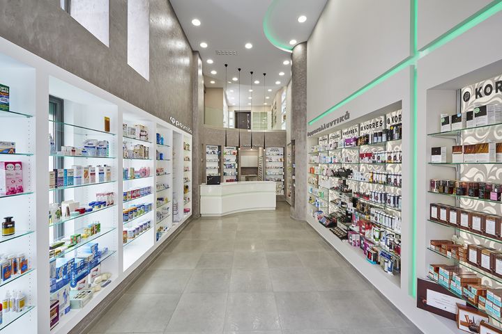
 Modern pharmacy design has come a long way from the traditional beige and white colored, linoleum-floored, fluorescent sterility so common in the big-box stores so prevalent in many American communities. Thanks to a new focus that independent pharmacy owners and managers have adopted, often as a way of helping them stand out from the large chain-store drugstores, pharmacy design has started taking into account the feelings of the customer. Many are striving to create a shopping environment that's homey, comforting, responsive and ultra-service oriented. There are lots of things that go into creating a kind of store where people enjoy their shopping experience enough that they're happy to come back often and anxious to share the experience with friends and family. Consider some of these.
It all Comes Down to Pharmacy Design
Creating a warm, welcoming, professional, light-filled, pleasantly-appointed pharmacy environment is really geared to one, single purpose. You want to draw in quality customers and make it easy for them to spend more time in your store and to walk out with armloads full of your fine-quality merchandise. Here are some things to incorporate into your pharmacy design to help make that happen:
- Walk into your store as though this was your first visit and look at things as though looking through the eyes of your customers. The experience starts with your pharmacy's exterior look, which should incorporate your brand colors, bold, descriptive signage and an attractive display in the front window (if you have one). The outside area should be free of litter and if there's any vegetation it should be well cared for. Not surprisingly, if the outside of the store isn't looking good, some potential clients won't even enter your doors.
- Fill the inside of your store with natural lighting coming in from large, uncovered windows and/or skylights. Do away with harsh fluorescent tube lights and replace with environmentally- and customer-friendly LED lights. Full-spectrum compact fluorescent bulbs can be used to simulate natural outdoor lighting with focused LEDs being used to highlight specific merchandising areas.
- The entry area should include an eye-catching display of hot-moving products, seasonal and holiday items or those being offered on discount. The entry area should set the tone of your store. The pharmacy counter should be located in the rear of the merchandise area so that customers have to walk through various sections to reach it, but it should be visible from up front.
- Display shelving should be set up in such a way as to direct customer foot traffic in a predetermined direction. Colorful signage should be placed to indicate each section of the merchandising area and informational stand-alone displays can be used to create interest and gain the attention of shoppers passing by. Shelving should be modern and attractive and not more than head height, with gondolas in the center of the store and wall units on the perimeter. These can be outfitted with pegboard or slat-wall backings, which can accommodate a variety of display accessories.
- It's important to provide resting areas strategically throughout the store, especially near the pharmacy counter where clients may be waiting for their prescriptions to be filled. Even better is to create a coffee/tea bar or soda fountain counter with some small tables and chairs where clients can sit and visit with others. This area should include some impulse-buy display shelves or bins.
Pharmacy design done properly will help increase the number of customers coming into your store, the amount of time they spend shopping and your bottom line. Use these and other tips to improve the customer shopping experience.


