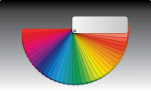
 What’s your favorite color? Maybe you gravitate toward that paisley tie because it communicates something quirky about your personality. Maybe that little black dress is your favorite simply because you know you look elegant in it. But your wardrobe is only one use of color; it also has a story to tell in your pharmacy decor. Color psychology is a powerful, yet often-misunderstood, tool in your visual merchandising arsenal. Color theory is a key part of your shelving design consultation with Shelving Design Systems.
What Color Psychology is Not
Before we get too far into this, it’s worth listening to Gregory Ciotti of Psychology Today, who reminds us that “the idea that colors such as yellow or purple are able to evoke some sort of hyper-specific emotion is about as accurate as your standard Tarot card reading.” That doesn’t mean that color psychology is invalid or useless, however. It just means that it needs to be given its proper weight in your visual merchandising. We shouldn’t ignore it, nor should we place too much emphasis on it.
How Color Psychology Works
Different colors communicate different meanings, often on a subconscious or emotional level. We hasten to point out, however, that these meanings are not universal; there are variations in culture and individual conditioning that can make the same colors mean vastly different things to different people. These should, therefore, only be viewed as guidelines.
Common Colors and Their Meanings
Have you ever wondered why white predominates in pharmacy decor and in the medical profession? It’s common because it carries a connotation of purity and cleanliness. We mention this first because you don’t necessarily want to reinvent the wheel, and also because a white background is a great way to make splashes of color in your visual merchandising stand out.
Let’s briefly consider the rest of the color wheel:
-
Red reminds shoppers of excitement and danger (think of a stop sign or red sports car), but in certain logos like CVS and Walgreens, it’s also a reminder of strength
-
Orange, found in logos like Home Depot, has come to symbolize value and lower prices
-
Yellow is a sunny, summery color that’s good for brands or areas meant to emphasize their warmth
-
Green is synonymous with the environment, sustainability, and responsibility; its ties to nature make it a popular color for supplements and allergy medications
-
Blue is the color of competence, security, and dependability
-
Purple adds a touch of elegance and style
-
Pink is synonymous with femininity and beauty
-
Brown is perceived as woodsy and masculine, which is why it’s so often found in products and brands targeted to men


